
With Excel, you can easily create many kinds of charts for educational or professional purposes. Easily create pie graphs, bar graphs, and more.
Download the example to follow along
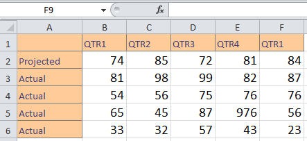
In the spreadsheet, you’ll see stats from two quarters of business. We’ll create a chart in Excel using this information.
Click a cell anywhere in the data. Next, click the “Insert” tab and to find a charts section.
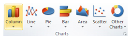
There are buttons for column, line, area, scatter, and others.
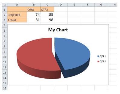
Click on the chart you want. When you click it, you’ll find you can easily move it around and resize things. When you select the title, you can rename it.
In the Excel Tool Ribbon, multiple “Chart Tools” show when you select the chart. You can change the layout and styles for your chart with these tools.
![]()
Three tabs appear – Design, Layout, and Format.
Design is the default tab. You can add titles and move things around in the layouts area and modify colors in the Styles area.
Inside the Layout tab, you can modify titles, data labels, and legends.
You can work with shapes and text in the Format tab. With these tabs, you can customize your chart to get the results you need.
Related Templates:
- How to Make a Gauge Chart in Excel
- Using the Trendline Feature in Excel
- Homeschool Diploma Template
- Project Status Analysis Workbook
- Medical Office Layout
View this offer while you wait!