
Mapping the heat signatures for smaller populations is made simple with the free Awesome Heat Map Chart. This template allows you to track the temperature for different locations and enter the population information so you can see the environmental impacts of larger populations.
This free document is perfect for data collection. You will start by entering your initial data in one tab and then continue doing so over time, you will have multiple options to observe you data over a 1-year and a 4-year period.
You can start using this template for free by following the set list of instructions given below.
Using the Awesome Heat Map Chart
To download the free Awesome Heat Map Chart template, you will simply need to click the link at the bottom of this page.
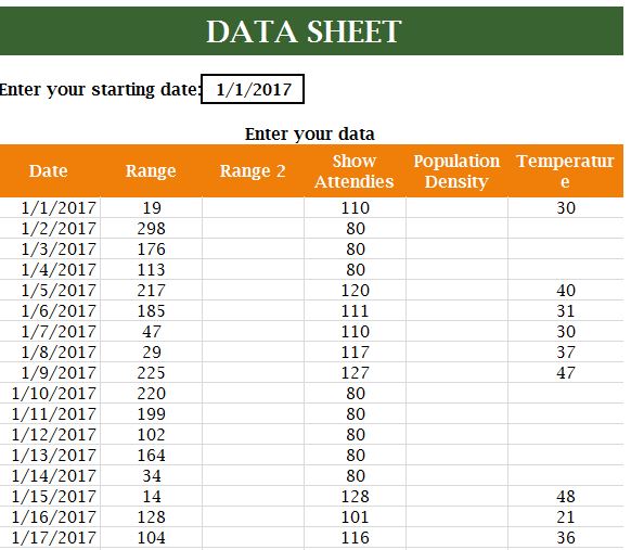
Start by going to the “Data” tab at the bottom of your page and selecting your initial start date for collecting data.
When you want to enter the temperature for a given instance, go to the table below and give the date, range, attendees (population), population density, and temperature.
Each day, you’ll continue to add new data points.
When you want to review your data, you will see a few other options. If you have enough data, you can see a 4-year view of the information and a 1-year view.
Above each view, you will also get a table showing the averages, highs, and lows of your data sets.
Finally, the “Holidays” tab is where you’ll enter outlier information for people leaving an area for the holidays.
When you finish entering your data, you will be left with a complete data sheet of your temperature information.
You can start collecting data today; simply follow the link below to get started!
Download: Awesome Heat Map Chart
Related Templates:
- Business Sales Report
- Temperature Converter Sheet
- Vertical TimeLine Chart Template
- Year-End Shipping Deadlines
- Basal Body Temperature Chart
View this offer while you wait!