
The Pie Chart is a representation, that while simple, offers a very clear view of a situation or problem, offering percentages in a format that’s easy to understand. The viewer or receiver of information can interpret the results seamlessly, very quickly, without too much intellectual work. A Pie Chart is perfect for giving snapshots, quick and effective looks at any statistical work where percentages are relevant.
We can see what percentage voted for the Democrat, which for Republican, and which for other party candidates. We can ascertain, quickly, what percentage paid the taxes; or what the taxes went toward: 30 percent for education, 22 percent for road maintenance, etc. Pie graphs are easy to use, easy to make, and extremely effective.
Benefits of Using a Pie Chart
One area that a Pie Chart can help with is in the area of credibility since statistics in general–or numeric representations–do offer the credibility that research can bring to a piece of writing, news report, financial report, church newsletter, or what have you. People tend not to–and should not–trust information that is ill-researched, overly biased or lacking facts. Facts cannot be disputed, and information that relies on them tends to be trustworthy whereas opinion-based writing has its place but does not necessarily earn our respect as being true or trustworthy.
Since a Pie Chart represents factual information, it brings the credibility of facts and research to any communication.
Finally, a Pie Chart is easy to make and use. It takes little time to do the research to include one. Information that can be presented in tandem with an article include town or city statistics, or death rates of certain diseases. These are easily obtained via websites online, or with a little research, and they offer a sidebar that is relevant, interesting, and widens the scope of the article.
Conversely, a Pie Chart can be created through cold calling, surveying people in a town, etc. but to do would take much time, and the results would have to include a quorum or some number called that is required so as to avoid people calling only three people in town and then trying to come to some conclusion or interpretation. A quorum would represent as many people as required to give information that is relevant.
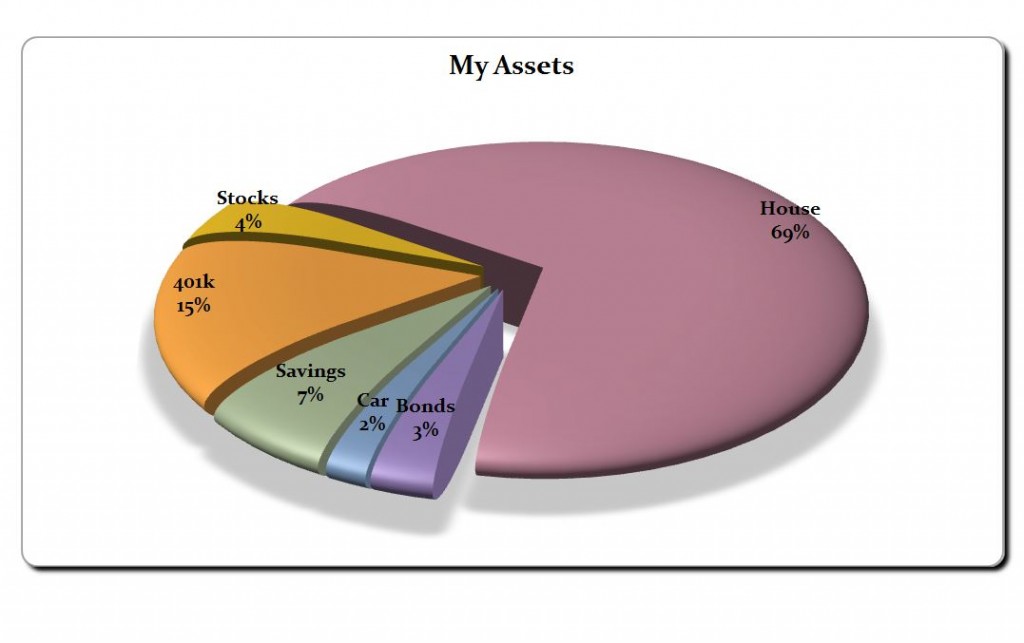
Download: Pie Chart
Related Templates:
- Excel Payroll Calculator
- Sales Receipt Template Word
- Pie Chart Creator
- 2012 Tax Calculator
- Gantt Chart Worksheet
View this offer while you wait!